Work / UX/UI case study

UX/UI case study

How I design a site around one kind of owner: the challenge, the goal and the decisions behind each example. Open any example site to see the result.

Five concept studies, one for each kind of owner I work with. The businesses are fictional and the photos are illustrative, so these show how I design for each type of business, not results for real clients.

Concept study

Real estate agents

Landing page: one offer, one action
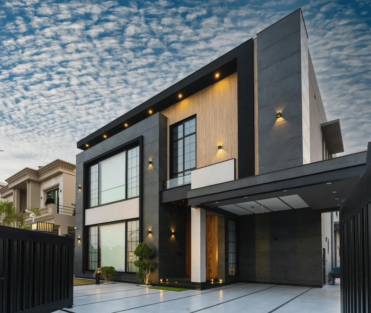
A modern home with a for sale sign, used as the hero image of the real estate example
Hero image of the example landing page

The challenge

Agents attract views on social media but rarely capture a name, an email or a phone number.

The goal

Turn a visitor into a named lead with one free, useful offer.

Key design decisions

  • One offer above the fold: the free neighborhood and offer guide. The consult is a quiet second option.
  • A three-field form (name, email, buying or selling) that takes seconds.
  • A "What is inside" row so people know exactly what they get before they type anything.
  • The agent portrait and license line sit before the final call to action to build trust.
  • One label, "Send me the free guide", used every time the action appears.

What I would measure

  • Form completion rate
  • Guide requests that turn into booked calls
  • Time to first reply
Smiling real estate agent holding a tablet
Maya, independent agentOwner persona. Illustrative photo.
Open the example site
Concept study

Trade professionals

Landing page: a fast quote from a phone

A carpenter in protective gear sanding wood, used in the home repair example
Photo band from the example landing page

The challenge

Customers search from a phone, in the middle of a problem, and call the first business that answers.

The goal

Make asking for a quote the fastest thing a visitor can do.

Key design decisions

  • Tap-to-call in the header, plus a sticky call bar on phones.
  • A quote form with four fields: name, phone, what is needed, and ZIP code.
  • A promise to text back in minutes, placed right next to the form.
  • Services written in plain language with simple icons, not trade jargon.
  • Areas served shown as simple tags so people know quickly if you cover them.

What I would measure

  • Calls and form sends from mobile
  • Speed of the first reply
  • Quotes that become booked jobs
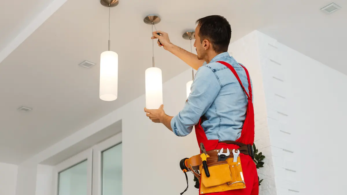
An electrician installing pendant lights
Sam, home repair proOwner persona. Illustrative photo.
Open the example site
Concept study

Independent shop owners

Full site: shop, visit and story

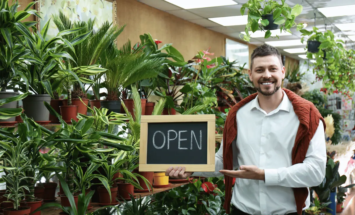
A shop owner holding an open sign among plants, used as the plant shop example hero
Hero image of the example full site

The challenge

Neighbors want to know what is in stock, when you are open and where to park before they leave the house.

The goal

Make it easy to shop online for pickup, or to find the front door.

Key design decisions

  • A four-item navigation: Shop, Visit, Our story and Newsletter.
  • Weekly highlights instead of a full catalog, so the page stays fresh and quick.
  • Hours and address in their own section, with a map slot.
  • The owner story and photo for trust, since customers choose a shop for the person behind it.
  • A one-field newsletter signup to turn visitors into repeat customers.

What I would measure

  • Pickup orders
  • Taps on directions and phone
  • Newsletter signups
Smiling shop owner in an apron
Rosa, shop ownerOwner persona. Illustrative photo.
Open the example site
Concept study

Solopreneurs

Landing page: personal brand and a booked call

A bookkeeper reviewing an invoice, used as the solopreneur example band image
Image band from the example landing page

The challenge

A one-person business has to look reliable without a team page or a big logo wall to prove it.

The goal

Get a visitor to book a free intro call.

Key design decisions

  • A headline written in the owner’s own voice, about the visitor’s problem.
  • Three plans with prices shown, so nobody has to ask what it costs.
  • A "One person, start to finish" section that turns being solo into a strength.
  • A time-slot picker inside the page, so booking never means leaving it.

What I would measure

  • Intro calls booked
  • Which plan people choose on the call
  • How visitors found the page

Other solopreneurs this layout fits

A content creator recording at a desk with a microphone and phone
Content creator
Smiling business owner leaning on a desk
Jordan, bookkeeperOwner persona. Illustrative photo.
Open the example site
Concept study

Local service providers

Full site: services, pricing and booking

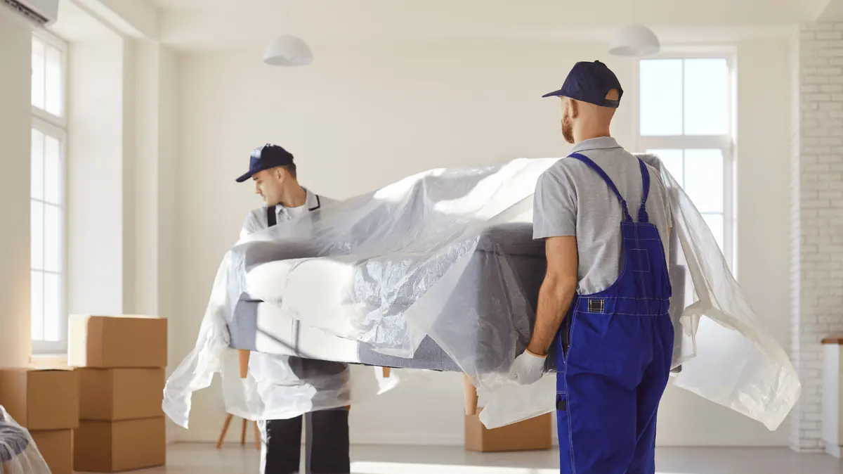
Two movers carrying a wrapped sofa, used as the moving company example hero
Hero image of the example full site

The challenge

Customers hesitate when they cannot see a price or know whether you are free on their date.

The goal

Let a visitor check availability in under a minute.

Key design decisions

  • An availability form in the hero: ZIP code, service, date and email.
  • Price cards with "from" pricing, plus add-ons shown as simple chips.
  • A three-step "how it works" to remove the fear of the unknown.
  • A short FAQ that answers the questions people ask before they book.
  • Photo slots for real jobs, because proof beats promises.

What I would measure

  • Availability checks
  • Checks that turn into bookings
  • The most-opened FAQ questions

Other local service providers this layout fits

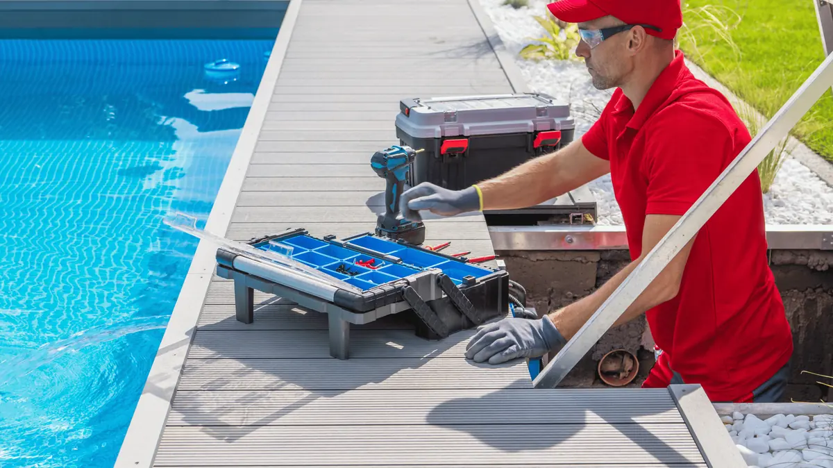
A pool technician installing equipment beside a pool
Pool service
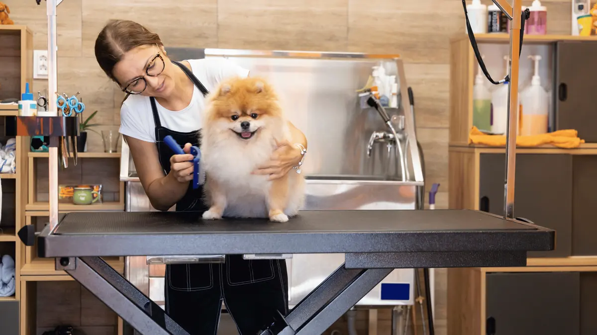
A pet groomer brushing a small dog
Pet grooming
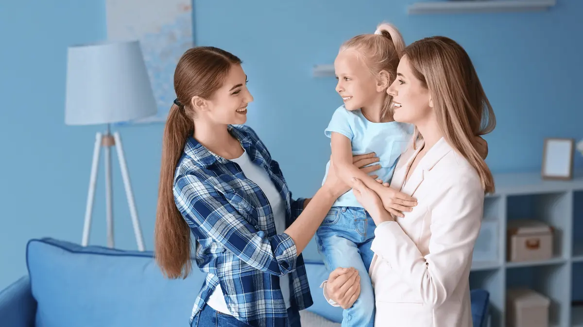
Two women smiling with a young child in a living room
Child care
A personal trainer reviewing a plan with a client in a gym
Personal training
A pet groomer brushing a small dog on a grooming table
Local service proOwner persona. Illustrative photo.
Open the example site

Want a site designed around your business?

Tell me what is slowing you down. I reply personally, usually within one business day.

Book a free discovery call